Introduction –
In modern organizations, especially those operating in hybrid or distributed environments, understanding employee engagement across different locations has become increasingly important. Traditional methods such as spreadsheets and static dashboards often fail to provide meaningful insights into geographical patterns. Geospatial data visualization offers a more dynamic approach by transforming engagement data into visual maps. One of the most effective ways to achieve this is through an Employee Engagement Heat Map, which enables organizations to analyze workforce sentiment based on location.
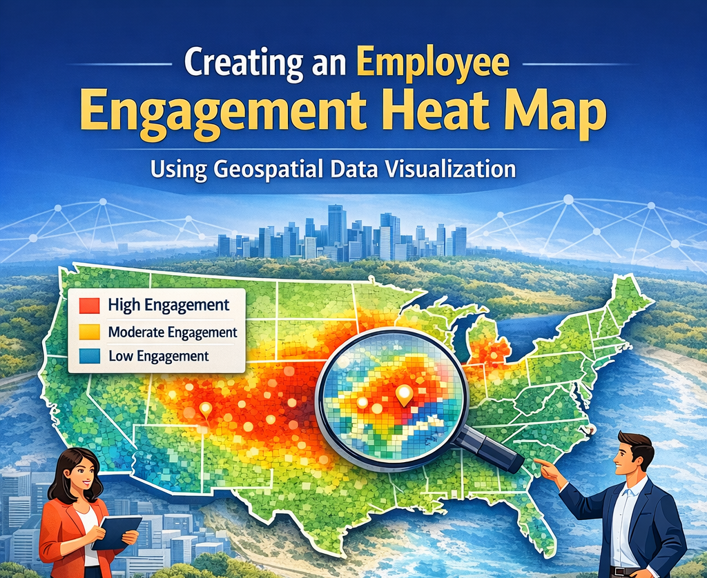
What is an Employee Engagement Heat Map?
An Employee Engagement Heat Map is a visual representation of employee engagement data plotted across geographical locations. It uses color gradients to indicate varying levels of engagement, allowing decision-makers to quickly interpret patterns. Typically, warmer colors such as red and orange represent higher engagement levels, while cooler colors like blue and green indicate lower engagement. This form of visualization helps organizations instantly identify regions where employees are highly engaged and areas that may require attention.
Importance of Geospatial Visualization in HR –
Geospatial visualization plays a crucial role in enhancing HR analytics by adding a location-based dimension to engagement data. Engagement levels often vary due to cultural differences, leadership styles, or regional policies, and these variations can be difficult to detect using traditional reports. By using heat maps, organizations can make better decisions regarding resource allocation, employee programs, and leadership interventions. Additionally, visual representations improve communication with stakeholders, making complex data easier to understand and act upon.
Data Requirements for Building a Heat Map –
Creating an effective heat map requires accurate and well-structured data. Organizations typically rely on engagement survey results, Employee Net Promoter Scores (eNPS), performance feedback, and HRIS data such as employee location, department, and role. It is essential that the dataset includes a reliable location identifier, such as city names or geographic coordinates. Proper data cleaning, including removing duplicates and standardizing location entries, ensures the accuracy and effectiveness of the visualization.
Steps to Create an Employee Engagement Heat Map –
The process of building a heat map begins with collecting and preparing engagement data. Once the data is cleaned, the next step involves geocoding, where location names are converted into latitude and longitude coordinates. After this, organizations must choose an appropriate visualization tool, such as Tableau, Power BI, or programming libraries like Python’s Folium or Plotly. Engagement scores are then normalized and mapped to geographic points. Finally, a heat layer is generated using color gradients to visually represent engagement intensity across locations. Adding interactivity, such as filters and tooltips, further enhances the usability of the heat map.
Practical Use Cases –
Employee engagement heat maps have several practical applications in business environments. They help identify regions with low engagement, allowing HR teams to investigate and address underlying issues. Organizations can also evaluate the effectiveness of leadership by comparing engagement across teams and locations. In remote work settings, heat maps provide valuable insights into how distributed teams are performing. Additionally, they are useful for assessing the impact of HR initiatives by visualizing changes in engagement over time and across regions.
Best Practices for Implementation –
To ensure the success of an engagement heat map, organizations should follow a few best practices. Protecting employee privacy is critical, so data should always be aggregated rather than displayed at an individual level. Regular updates are necessary to keep the insights relevant and actionable. It is also important to combine quantitative data with qualitative feedback to gain a deeper understanding of engagement trends. Keeping the visualization simple and intuitive ensures that stakeholders can easily interpret the data.
Challenges and Limitations –
Despite its advantages, creating an employee engagement heat map comes with certain challenges. Incomplete or inconsistent location data can affect accuracy, while survey biases may impact the reliability of engagement scores. Integration with multiple HR systems can also be complex. Additionally, organizations must avoid over-reliance on numerical data and ensure that insights are interpreted in the right context.
Future Trends in Engagement Visualization –
The future of employee engagement visualization is evolving rapidly with advancements in technology. Organizations are increasingly integrating artificial intelligence to predict engagement trends and identify potential issues before they escalate. Real-time sentiment analysis from communication tools is also gaining traction. Furthermore, immersive and interactive visualization techniques, including 3D mapping, are expected to enhance how organizations interpret and act on engagement data.
Conclusion –
Creating an Employee Engagement Heat Map using geospatial data visualization provides organizations with a powerful tool to understand workforce dynamics across locations. By converting complex engagement data into intuitive visual insights, businesses can take a more proactive and strategic approach to employee experience. In an era where engagement directly impacts productivity and retention, leveraging such data-driven techniques is essential for long-term success.